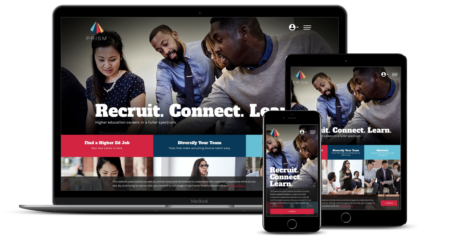
The Content First Approach to Responsive Design
Author: Rain Michaels
Summary: Responsive Design is a basic requirement for any new project, however, the way we approach responsive design can vary widely depending upon priorities. At Stauffer, we follow the Progressive Enhancement (or Content First) model.
What does this mean?
As Responsive Design has become a basic principle for web application design, there is simply zero excuse for any contemporary site accessible today to not beautifully render well across the diverse and ever-changing range of different devices and screen sizes.
Today, search engines penalize sites that are not yet responsive, and many are now seeing analytics with over 50% mobile usage. In fact, an increasing number of web application users are mobile-only — in 2017, approximately 15% of all users in the US — meaning, their entire experience of the web is small-format.
While responsive design is no longer optional for any web application, it is also not simple. It requires web application owners to think critically about the nature and presentation of their content. It also requires designers — a demographic that often cares about pixel perfection — to let go of control of how the end consumer will experience their work.
This presents a complex challenge, and like most good challenges, there are different paths to approach the solution. In the last few years, three distinct methods for making a site friendly across devices have emerged, and the one you choose says a lot about your priorities.
These methods include:
- Separate web applications built for each environment
- Graceful Degradation (most common)
- Progressive Enhancement (also known as Content First, or sometimes simplified to Mobile First)
Providing Users A Beautiful Experience
Stauffer subscribes to Progressive Enhancement, most of the time specifically focusing on the Content First approach. Depending on the project, we may vary our mindset to adjust to unique project priorities. However, our focus remains on providing users a beautiful experience when accessing what they need within their context, and progressive enhancement gives us the best ability to achieve this goal.
That being said, every project has its own needs. Prior to commencement, the product owner(s) must identify their requirements — and understand their target audience — and select the approach that will result in the greatest success. For this reason, it is important to understand each of the three models individually, and the advantages and disadvantages of each.
Separate Web Application:
Advantages & Disadvantages
Separate Web Application
In the early days, when mobile was really taking off, basic responsive tools such as media queries were just emerging and not fully production ready. The solution, therefore, as to offer an entirely separate experience (or Separate Web Application) to those using mobile devices. We have all experienced this when visiting a site on a mobile device, and suddenly the URL changes from www.”site-you-visited”.com to m.”site-you-visited”.com. This solution is still in practice today, as it has some key advantages.
Advantages / Pros:
- Each environment is isolated, so designers can build a user experience and provide content specific to the device being used;
- Designers and content owners have greater control over the end experience, and can be more certain of the pixel-perfect experience they crave;
- Each experience can be designed one at a time, rather than having to think about all experiences in a flexible manner.
Disadvantages / Cons:
- Each application must be maintained independently, which can be cost prohibitive;
- There are now so many different devices out there that it is actually impossible to entirely optimize for each and every one, so you introduce a level of risk for how your application is experienced on one of the outliers;
- Technology is changing rapidly, and if your application is optimized for a specific device today the nature (size, definition, something else) of that device may change tomorrow, and now your application is subpar.
If you select this approach, you can hone your application without limits. However, it is recommended that you have substantial resources available to support its maintenance.
Graceful Degradation:
Advantages & Disadvantages
Graceful Degradation

The Graceful Degradation model is the easiest and most common responsive approach, as designers and developers are most familiar (due to decades of experience) with designing for desktop, and clients are most often interested in seeing large-format designs.
In this approach, the site is designed for the ideal environment (typically, large format PC / desktop). Once designs are approved, the designer and developer will make sure that the site still looks acceptable as devices get smaller and less robust. This means checking how the design degrades, then adjusting any serious issues.
What makes this approach great is the convenience for everyone to communicate, due to wireframes and designs being presented in a familiar environment.
This approach becomes problematic, however, if you have critical features in sidebars that are dropped to the bottom on mobile, or if you have exceptionally long text on your page. More importantly, this approach makes it more difficult to produce a genuinely accessible product, and shortcuts or compromises are often made in the smaller or less technologically advanced environments, which lead to a less robust experience.
Graceful degradation prioritizes gloss and cutting-edge experiences and technology (often referred to in the industry as “sexy”), over the content or a quality user experience. For instance, if you are a large media company promoting enhanced technologies, then this approach may be right for you. However, it is important that you understand why it is that you are choosing to go this route.
Advantages / Pros:
- Communication is easier
- It’s a more familiar environment for long-time designers and clients
- If your target users are primarily using top-of-the-line technology only, this may be the best workflow
Disadvantages / Cons:
- Harder to make accessible
- Often results in a usable but less ideal experience for users with smaller devices or less advanced technology
Progressive Enhancement:
Advantages & Disadvantages
Progressive Enhancement

Progressive Enhancement, essentially the opposite of Graceful Degradation, is Stauffer’s preferred method, due to its unique ability to create experiences that are synergistic with the reason a user is on a specific device and prioritizes content (which is, typically, the reason your user has come to your web application).
This model begins with ensuring that the essentials are present and easy to use on the simplest of devices, and then progressively enhancing the user experience and features as more physical space and technology become present on the device being used.
With progressive enhancement, the application is designed and developed to respond to a user’s behavior and environment based on needs, screen size, platform, and orientation.
In practice, this often means that the first iteration of the UX (wireframes and comps) will be in the mobile format. However, this is not always true, as ultimately the team must understand its users and content prior to determining the best approach. The goal is to clearly define the essential elements of the application, such as the elements integral to its success. These must be an enjoyable part of every experience, no matter how bare.
Mobile First and Content First are two catch-phrases often used in reference to Progressive Enhancement, yet even these mean something different from one another. As with Mobile First, you design for the mobile environment first and work your way up. With Content First, you think carefully about what your users need (or what you want them to get), then design for the smallest, least-advanced environment first and work your way up. While the difference may seem semantic, it is not. Mobile First prioritizes how the product looks in the mobile environment, whereas Content First prioritizes how the content is accessed in the most basic environment.
Progressive Enhancement, on the other hand, is about creating experiences that are, across the board, ideal for the environment from which they are being accessed.
Advantages / Pros:
- Accessibility is part of every consideration from the ground up
- The application will more readily adjust as technology shifts
- You can be confident that a user’s core needs are met, regardless of the technical limitations faced when accessing your application
- You clearly understand your content strategy from the earliest stages of the project, making it significantly easier for you to produce and maintain the content you need
- You will ultimately have a more future-proofed application
Disadvantages / Cons:
- This is a less familiar way of designing, especially for those who have a hard time letting go of pixel-perfection
- Executive stakeholders are often looking for gloss when they see comps, and the initial rounds will likely be on the simpler side, so communicating the goals to all parties is critical
Focus On Your Goal
Stauffer employs Progressive Enhancement, with a constant eye toward Content First thinking, as this ensures the highest level of success for all users regardless of their device. It enables us to truly hone in on the bottom-line essentials. As the interface is enhanced for larger formats or more feature rich technology, the essential features remain at the core of every experience, while more gloss, glamour, excitement, and opportunities for play are opened up depending on technology.
In essence the model or approach we use is secondary to the overall goal of the product. Before going down any path, it is essential that all parties understand the requirements and the reasoning behind those requirements. Occasionally, it is worth following a different model to achieve the best results for a given application.
Stay true to the purpose, not the mindset or buzzword. This is the essence of progressive enhancement.